A Winter's tale - another commission finished
Today has reminded me why I love painting and why this hobby of mine has stayed with me when so many others have gone. No, it's not because it earns me money! The smile on the clients face when he saw his painting for himself for the first time. He was rather pleased to say the least.

One happy client with his commissioned artwork by Roy P Awbery

A Winter's Tale by Roy P Awbery - close up
This painting was very challenging but I got a great deal of satisfaction from finally getting this one right. The original plan was just to have a night snow scene but, as the painting developed, the client asked for the addition of wolves and an elk.
I managed to capture a sense of movement with the animals which was not easy. I'd not tried to do it before but it seems to have worked.
I'm seriously pleased how well this one turned out and now understand why my followers were not too happy with the very simple Jumble Animals. Lesson learned!
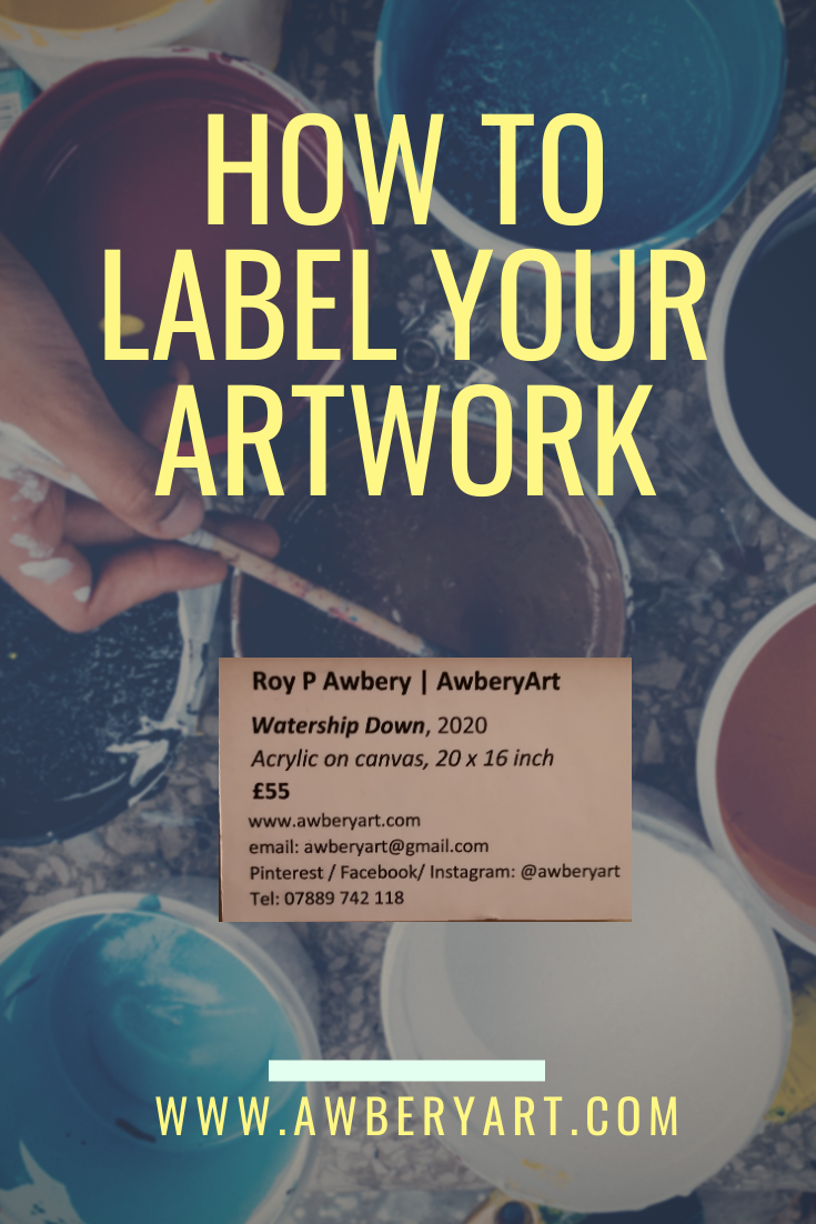
How to label your paintings and artwork
How to produce professional looking labels for paintings and artwork.
So, after some trial and error, mostly error to be fair, I’ve finally realised how to label my paintings both for display and for sale. It’s actually really simple and all it takes is a little crafting.
First, what not to do:
I’ve now sold my art at a craft fair and on reflection realised that stickers with pricing on them is really not ideal and looks unprofessional. I also had my work displayed earlier in the year and forgot to put any instantly visible details of who I was or how to contact me! More recently though, I saw another artist’s display and they used simple card parcel tags which had the price on one side and the name of the artist on the other. Still far from perfect. However, I then recalled what one sees in galleries and museums: clean, bold labels written in black on a white background with easy-to-read font and all the details anyone could need.
So this how I do it:
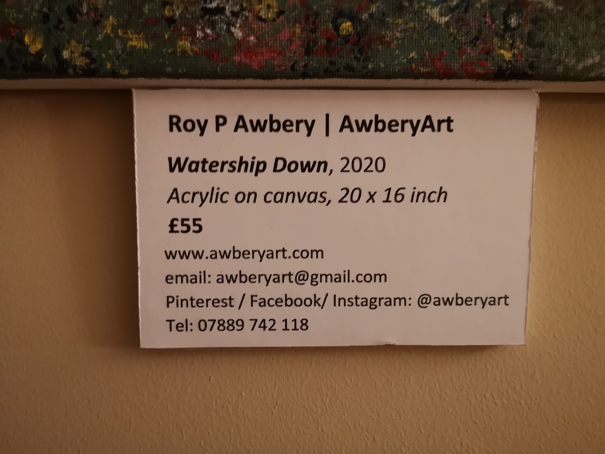
( Add your name or business name in bold
Add the title of your work and the year (same size font as above but in italics
Media type and size (and don’t write “mixed media” - it tells no-one anything meaningful!)
Write the price in bold
Next I include my contact details in the following order:
website (and I suggest buying a domain - longwinded web addresses just look amateurish)
Contact email address
Social media handle - I used the same, @awberyart, for all of mine and don’t forget to say which platforms you can be found on
Telephone number - especially useful if you are displaying in a public space such as café, library, waiting room etc.
Now set all of this up up in a word document and insert a single line border around it - this makes cutting easier later. Now go and print it out but see below before you do.
But don’t just print it on paper!
You need to print on good quality thick card that will run through your printer safely. I use WH Smith’s A4 Card which works just fine.
Next, you’ll need some white foam board which I pick up from Hobbycraft.
Now simply glue the cut-out printed label onto the foam board and ut out to create a single 3-dimensional plaque to mount next to your artwork.