
How to Choose the Right Artwork for Your Home
I believe that art has the power to transform and enhance the ambience of any living space. In this post, '’ll guide you through the process of choosing the perfect artwork for your home. Discover how to find pieces that resonate with your personal style and create a harmonious environment that truly reflects who you are.

Introduction
Welcome to my blog! I believe that art has the power to transform and enhance the ambience of any living space. In this post, '’ll guide you through the process of choosing the perfect artwork for your home. Discover how to find pieces that resonate with your personal style and create a harmonious environment that truly reflects who you are. If you have any questions or need personalized advice, don't hesitate to reach out to me. I’m here to help!
Understanding Personal Style
Your personal style is unique, and art should reflect that. Take some time to explore different art styles, from abstract and contemporary to impressionistic or minimalistic. Visit local galleries, browse online art platforms, and immerse yourself in various artistic expressions. Pay attention to what captures your attention and stirs emotions within you. Do you find yourself drawn to bold and vibrant colours, or do you prefer softer, more muted tones? Are you captivated by intricate details or more intrigued by simplicity? Understanding your personal style will help you curate a collection that speaks to your heart.
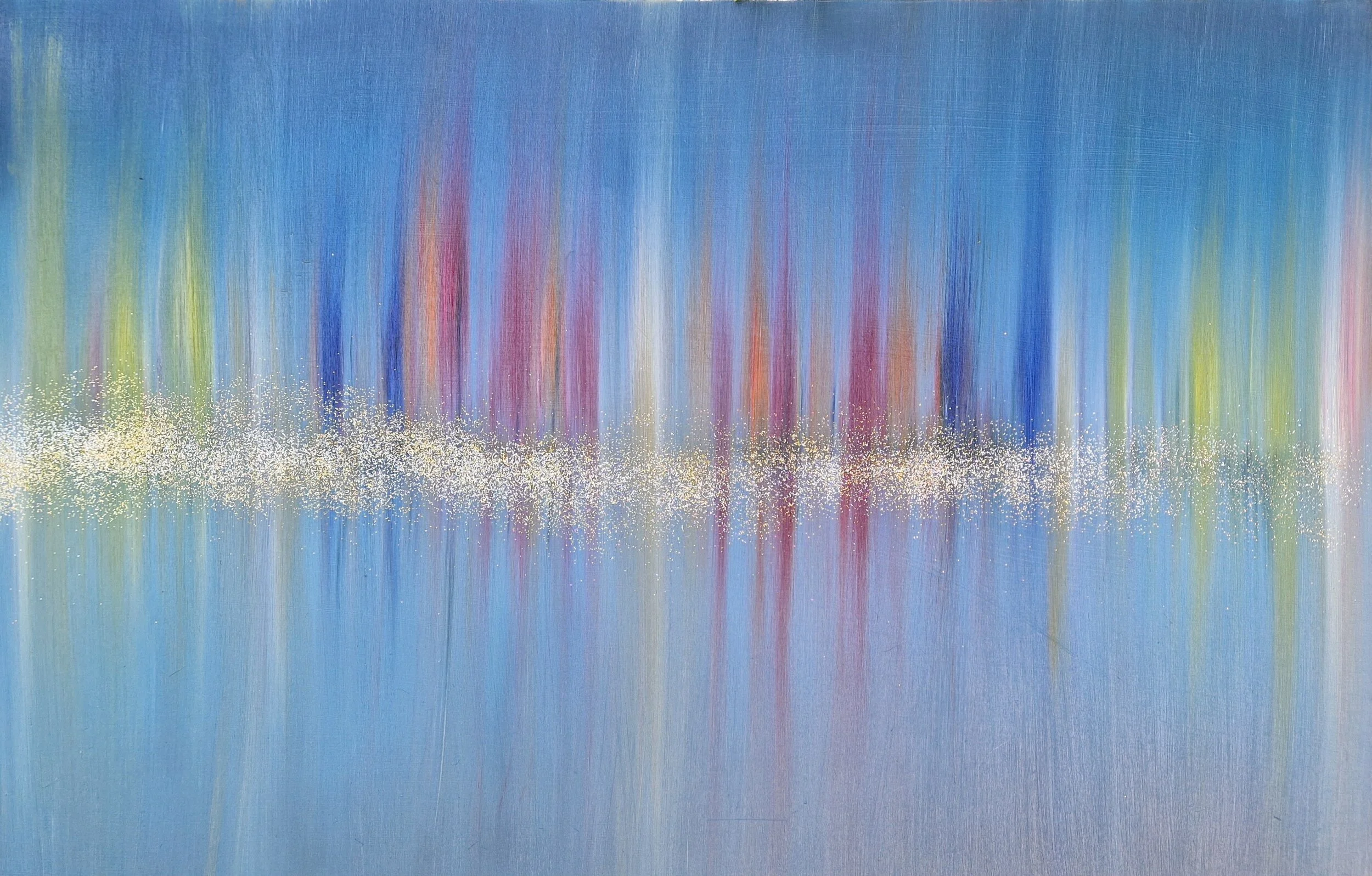
City Limits by Roy P. Awbery
Consider the Space
When choosing artwork for your home, it's essential to consider the space in which it will be displayed. Analyze the available wall space and take note of the dimensions. In larger rooms, bold and statement pieces can make a powerful impact, while smaller spaces may benefit from smaller or medium-sized artworks. Experiment with different orientations, such as horizontal, vertical, or square, to find the best fit for each room. For example, a tall and narrow wall may benefit from a vertical piece that emphasizes the height, while a wide and spacious wall could accommodate a larger horizontal artwork that creates a focal point. Consider the overall layout of the room and how the artwork will interact with other elements. By carefully considering the space, you can choose artwork that not only fits well but also enhances the overall aesthetic and atmosphere of the room.
Harmonizing Colors and Themes
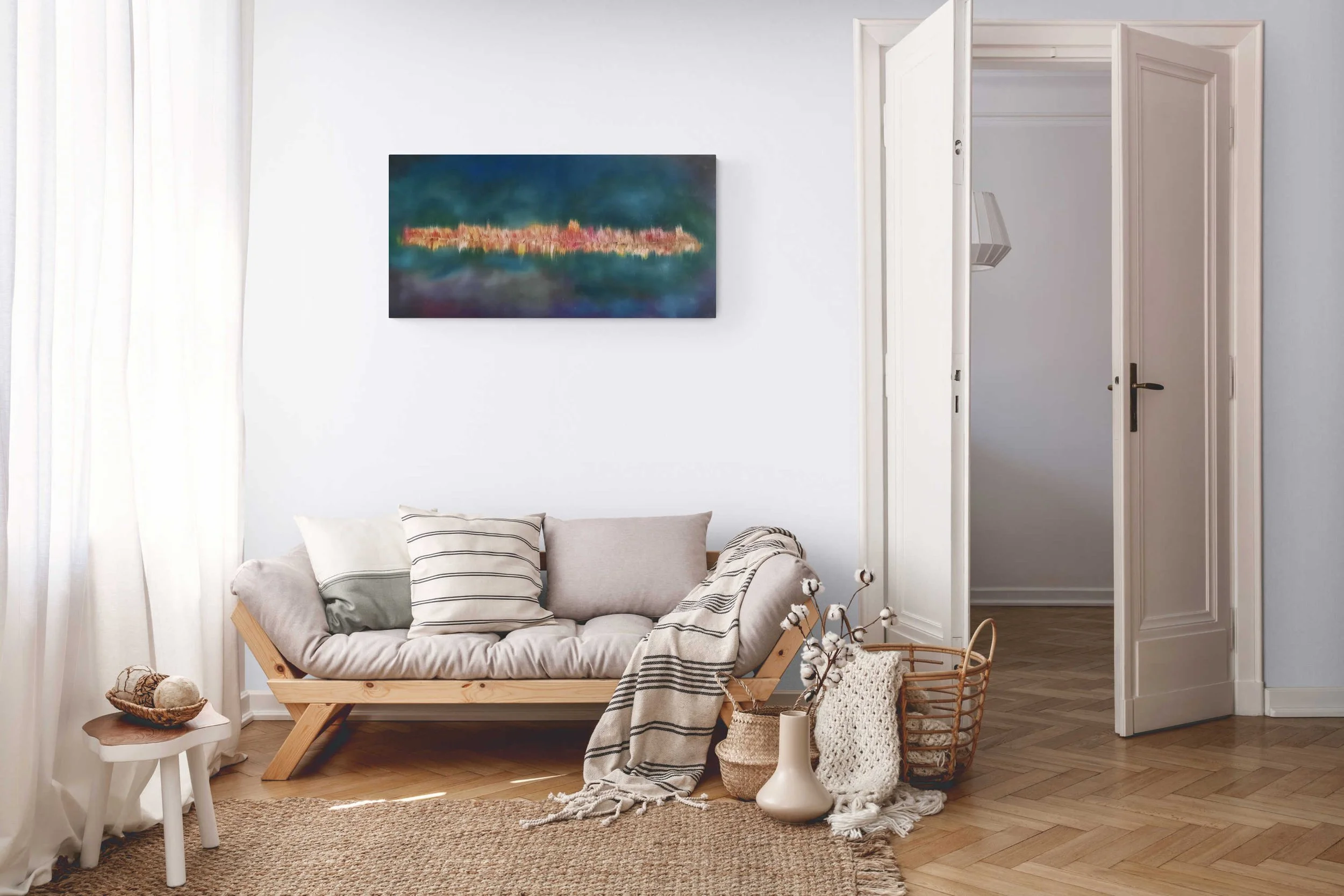
Add abstract art by Roy P. Awbery to your home decor.
Colours have the power to create a harmonious and visually pleasing environment. When selecting artwork, consider the existing color scheme of your space, including the walls, furniture, and decor. Choose artwork that complements or introduces new colors to enhance the overall ambiance. For instance, if your space features warm earth tones, consider artwork with complementary colors like blues or greens to create an intriguing contrast. Additionally, align the themes and subject matter of the artwork with the overall theme or vibe of the room. If you have a coastal-themed living room, artwork depicting seascapes or beach scenes can bring a sense of serenity and connection to the space. Pose questions to yourself: How can the colors and themes of the artwork enhance the atmosphere you want to create? What emotions or feelings do you want the artwork to evoke? By carefully considering the colors and themes, you can curate a collection that not only looks visually stunning but also resonates with the overall ambiance and personality of your home.
Finding the Right Balance
Integrating artwork into your space requires finding the right balance. Consider the interplay between artwork, furniture, and other decor elements. Create a focal point by placing a captivating piece in a prominent position, such as above a fireplace or at the centre of a gallery wall. Allow the artwork to guide the arrangement of other decorative items, ensuring a harmonious and visually pleasing composition. Experiment with different arrangements and groupings to find the perfect balance that highlights both the individual artwork and the overall aesthetic of the room. Take a moment to step back and assess the visual balance—does the artwork draw your eye in without overwhelming the other elements in the space? Remember that balance doesn't necessarily mean symmetry; it can be achieved through the careful placement of different elements to create visual harmony. Challenge yourself to think creatively: How can you arrange the artwork to create an interesting flow? What other elements in the room can complement and enhance the presence of the artwork? By finding the right balance, you can create a space that feels cohesive, visually engaging, and inviting.
Exploring Artistic Mediums
Artistic mediums offer unique qualities and visual effects that can significantly impact the atmosphere of a room. Paintings, prints, sculptures, and photography each bring a distinct character to a space. Explore different mediums and experiment with textures, materials, and finishes to add depth and variety to your collection. Consider the impact of a large-scale abstract painting, the intricate details of a handcrafted sculpture, or the captivating storytelling of a photographic print. Each medium carries its own expressive power and can evoke different emotions and moods. Pose questions to yourself: How do you want the artwork to interact with the surrounding space? Do you want a three-dimensional piece that adds depth and dimension, or a two-dimensional artwork that adds a splash of color and texture? By exploring different artistic mediums, you can find the perfect combination that resonates with your personal style and elevates the visual appeal of your home.
Seeking Authenticity and Meaning
When choosing artwork for your home, seek pieces that hold authenticity and meaning. Investing in authentic artwork or limited-edition prints adds value and significance to your collection. These pieces not only reflect your unique style but also support artists and their creative journeys. Take the time to connect with artwork that resonates with you on a deeper level, evoking emotions and telling stories that align with your personal narrative. Challenge yourself to think beyond mere aesthetics and consider the deeper meaning behind each piece. Does the artwork evoke memories or experiences? Does it convey a specific message or evoke certain emotions? By seeking authenticity and meaning, your collection becomes more than just decorative pieces—it becomes a reflection of your values, passions, and personal journey.
Conclusion
Choosing the perfect artwork for your home is an exciting and fulfilling endeavour. By understanding your personal style, considering the space, harmonizing colours and themes, finding the right balance, exploring artistic mediums, and seeking authenticity and meaning, you'll curate a collection that reflects your individuality and enhances the atmosphere of your living spaces. Let your home become a gallery of your own, filled with art that brings joy, inspiration, and meaning to your everyday life. If you have any questions or need personalized advice in choosing the perfect artwork for your home, feel free to reach out to us. We're here to help you create a space that truly represents who you are and resonates with your artistic vision. Happy art hunting!

Colour blind artist in great company!
How does one stand out in a world full of successful artists? Marketing people will say you need to find your USP or unique selling point. Mine? Being profoundly colour blind.
Can you see the number in the image here? No? Then, like me, you're probably colour blind. Colour blindness can come in a variety of forms including red-green (the most common); blue-yellow and monochromatic. Then there is me! My colour blindness appears to be a mixture of a problem with my eyes but also my brain. Rather bizarrely, I don't seem to be able to recognise most colours except really bold primary ones. Mixed colours completely confuse me and I'm unable to even suggest the name of a colour in many cases. However, I do still see in colour but possibly not quite in the way that you do.
There is no cure for colour blindness despite the ridiculous adverts one sees on the internet. The most awful of these are the correction glasses from Enchroma. They show clips of apparently colour blind people being given the gift of perfect sight with a pair of sunglasses. Thankfully science has stepped in to debunk these nonsense colour vision correction glasses.
So can I really be an artist with such a condition? Well, I'd argue that the proof is clear. Having been a selling artist for little more than a year I've sold 30 pieces. Many were commissions and the client knew I was colour blind. It's become my USP.
Of course, there are plenty of artists out there who are colour blind and some notable greats included. It's believed that as Monet developed cataracts his colour vision failed and even Vincent Van Gogh was thought to be afflicted.
If you're interested in Understanding colour blindness a bit more this link will get you started. Of course you can also ask me.

Can't see the number? You're probably colour blind!
A Winter's tale - another commission finished
Today has reminded me why I love painting and why this hobby of mine has stayed with me when so many others have gone. No, it's not because it earns me money! The smile on the clients face when he saw his painting for himself for the first time. He was rather pleased to say the least.

One happy client with his commissioned artwork by Roy P Awbery

A Winter's Tale by Roy P Awbery - close up
This painting was very challenging but I got a great deal of satisfaction from finally getting this one right. The original plan was just to have a night snow scene but, as the painting developed, the client asked for the addition of wolves and an elk.
I managed to capture a sense of movement with the animals which was not easy. I'd not tried to do it before but it seems to have worked.
I'm seriously pleased how well this one turned out and now understand why my followers were not too happy with the very simple Jumble Animals. Lesson learned!
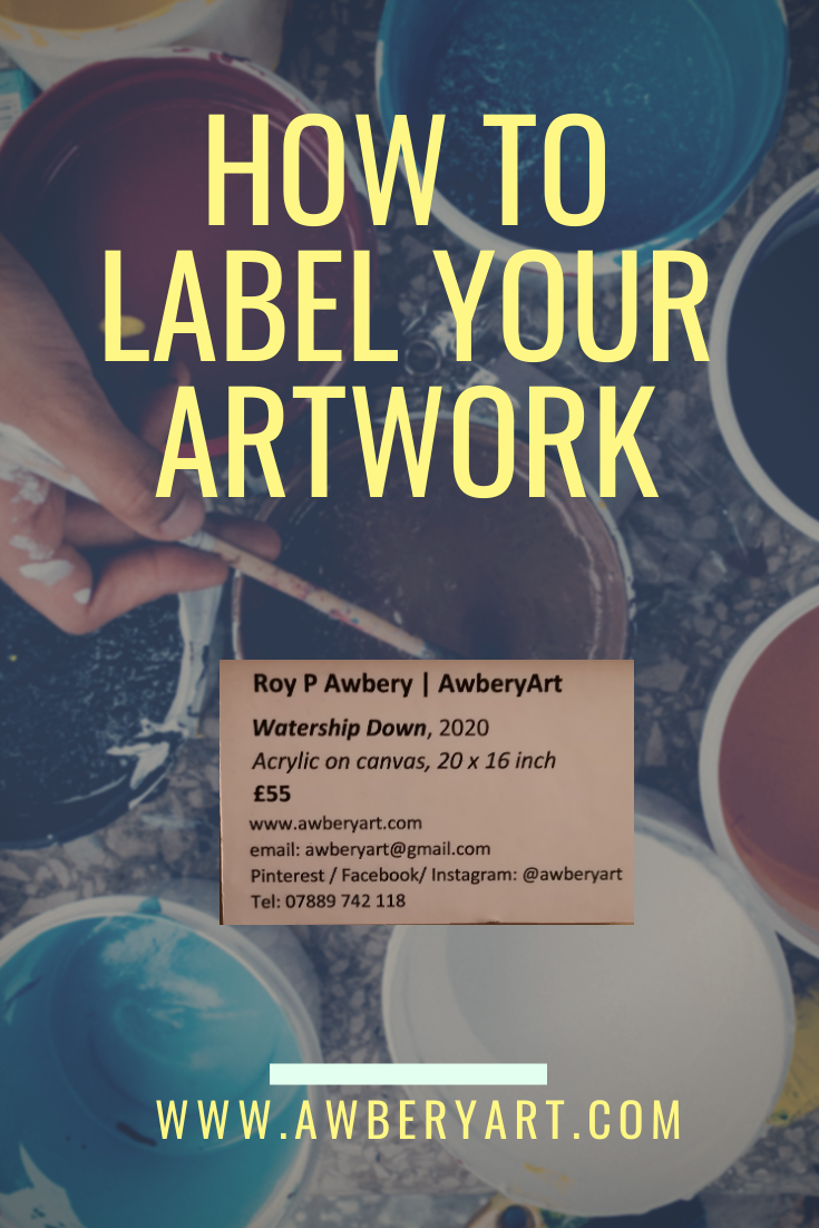
How to label your paintings and artwork
How to produce professional looking labels for paintings and artwork.
So, after some trial and error, mostly error to be fair, I’ve finally realised how to label my paintings both for display and for sale. It’s actually really simple and all it takes is a little crafting.
First, what not to do:
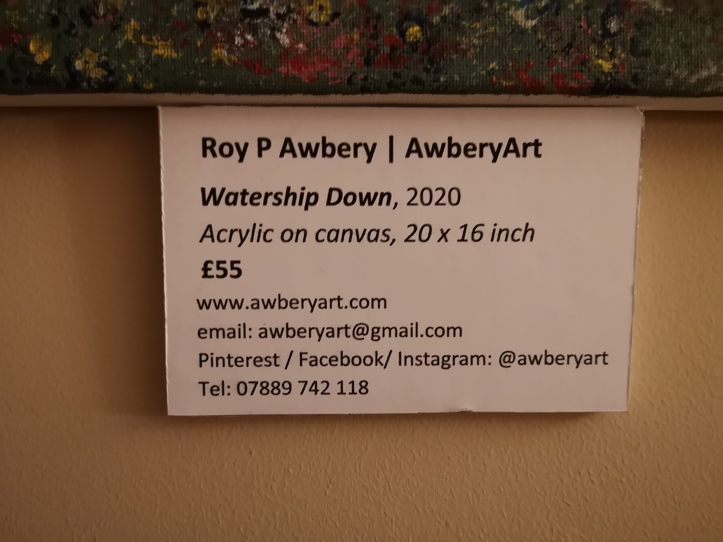
I’ve now sold my art at a craft fair and on reflection realised that stickers with pricing on them is really not ideal and looks unprofessional. I also had my work displayed earlier in the year and forgot to put any instantly visible details of who I was or how to contact me! More recently though, I saw another artist’s display and they used simple card parcel tags which had the price on one side and the name of the artist on the other. Still far from perfect. However, I then recalled what one sees in galleries and museums: clean, bold labels written in black on a white background with easy-to-read font and all the details anyone could need.
So this how I do it:
( Add your name or business name in bold
Add the title of your work and the year (same size font as above but in italics
Media type and size (and don’t write “mixed media” - it tells no-one anything meaningful!)
Write the price in bold
Next I include my contact details in the following order:
website (and I suggest buying a domain - longwinded web addresses just look amateurish)
Contact email address
Social media handle - I used the same, @awberyart, for all of mine and don’t forget to say which platforms you can be found on
Telephone number - especially useful if you are displaying in a public space such as café, library, waiting room etc.
Now set all of this up up in a word document and insert a single line border around it - this makes cutting easier later. Now go and print it out but see below before you do.
But don’t just print it on paper!
You need to print on good quality thick card that will run through your printer safely. I use WH Smith’s A4 Card which works just fine.
Next, you’ll need some white foam board which I pick up from Hobbycraft.
Now simply glue the cut-out printed label onto the foam board and ut out to create a single 3-dimensional plaque to mount next to your artwork.

How to paint a cityscape - A Labour of Love
Blog by colour blind artist Roy P Awbery on painting an epic night time cityscape inspired by New York, London and Toronto. The original acrylic on canvas painting took two months to finish. Find out more about the journey here.
The first time I painted a cityscape was a simple 7 x 8 inch canvas using acrylic paint. From a distance it looked okay but it wasn’t great, in my perfectionist opinion. Mind you, I had only been painting for about two months when I painted it. However, I always love a challenge and, having been inspired by my recent trip to New York, decided to have another go. Of course, being me I couldn’t keep it simple and decided to “go large”! And complicated! I never paint from photographs so this was going to be quite a task and I really didn’t know what the end result was going to look like. In essence, I would be as surprised as everyone else when it was finally completed.
My first attempt at painting a cityscape - 2 months after picking up a brush
My first step was to prepare the canvas and I knew that I wanted to create another night time scene but with a greater focus on the illuminated buildings. Because of the scale of this painting I knew that there would have to be some fine detail in the buildings and that an abstract approach wasn’t really what I was looking for. So, the first step was to get the background in and an outline of the buildings.

Background and building outlines complete the first stages
once all of the major elements and buildings were added it was time to start adding the fine detail and this painting was going to be all about the lighting during the night to give that iconic cityscape look. This part took an awful lot of patience and time!

The impression of the city lights beginning to take shape, layer by layer
Once the city lights were added, which was a real labour of love as each light needed to be added carefully and in several layers to get the effect I was after, it was time to move on to the foreground. I knew that I wanted to have a waterfront with the buildings gently reflected off the surface. It turned out to be a lot harder than I imagined and it took many attempts before I could crack it. I lost count how many times the Gesso undercoat was applied to effectively erase my unsuccessful efforts.

City lights almost completed and then onto the foreground reflections - a major challenge!
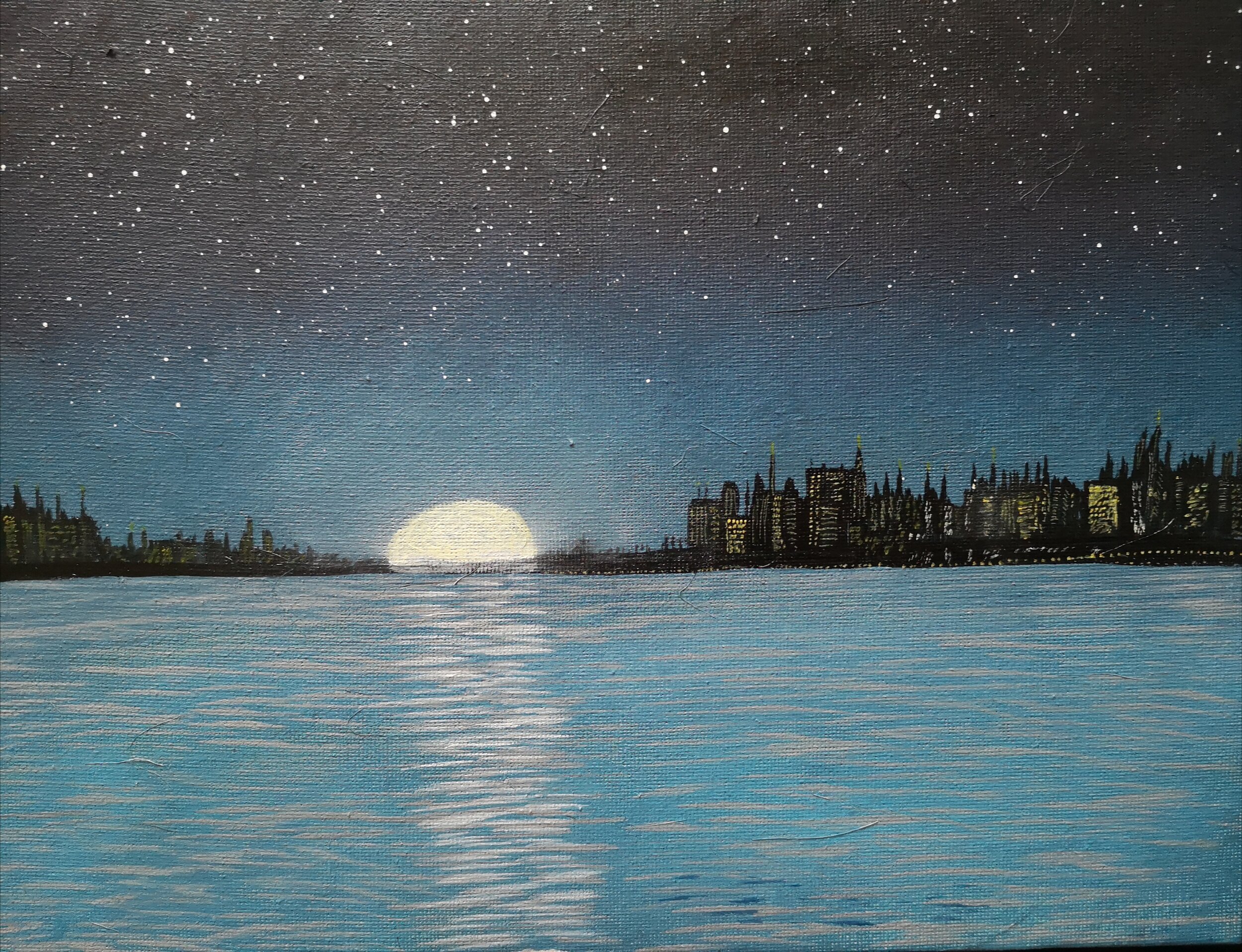
In the end, and after a great many attempts, I finally managed to get the reflections just about how I wanted them. If I’m really honest, I think they could have been better but I was up against a deadline to ensure this piece was finished in time for Christmas but overall I’m pleased with the outcome. This one is being given away as a gift but I think I will have another go as, despite the frustration and challenges, this was a lot of fun to create. So, here it is, the final finished painting. If you’re interesting in getting one for yourself I will be selling prints via my store at Etsy.

The finished painting complete with reflections.